My Nikon Z8 files at ISO 5600 to 25,600 cleaned up dramatically with DxO PureRAW 6 + DeepPRIME XD3 before I did any creative editing. Noise dropped, fine detail held together better than I expected, and the files were easier to finish.
What stood out
Happy accident outcome: A newbie mistake (leaving shutter speed at 1/800) turned into a strong real-world test of high-ISO recovery.
Firsthand result: All five examples looked meaningfully better before any post-processing style work.
Best stress test: ISO 25,600 still produced usable detail after DeepPRIME XD3.
Workflow note: Z8 processing felt quicker than my prior Canon/Sony PureRAW runs (subjective, not lab-timed).
Practical value: This is a rescue/quality tool, not a mandatory everyday step for every frame.
What happened in the field
I was out shooting with my daughter, having one of those great father/daughter conversations while walking through the woods. After some action shots, I forgot to reset my manual shutter speed from 1/800 sec. For the rest of the walk I forced higher ISO than I wanted due to this silly mistake..
While I was happy with the photos, I was so frustrated with myself, and ready to salvage what I could. I usually reach for Imagenomic Noiseware first, but these files were so bad that I decided to run them through DxO PureRAW 6 first.
The point of this article is simple: these files recovered far better than I expected, and they recovered extremely well before I started any of my normal editing.
Lightroom comparison screenshots (the setup)
Girl reaching for a leaf (ISO 6400)
Lightroom side-by-side preview for Z8-866 before and after DeepPRIME XD3.
Arms folded portrait (ISO 8000)
Lightroom preview showing the noise/detail tradeoff before final editing.
Happy smile on a forest path (ISO 7200)
Lightroom preview with visible high-ISO cleanup from DeepPRIME XD3.
Walking up a tree (ISO 25,600)
The toughest file in this set: ISO 25,600 previewed in Lightroom before creative edits.
Pose on tree branch (ISO 5600)
Lightroom side-by-side for cleaner tones and retained texture after DeepPRIME XD3.
Before / After recovery results
1) Girl reaching for a leaf — ISO 6400
This one stands out because of the cleaner high-ISO output without turning skin and foliage into mush.
Before |
After ISO 6400: fine texture in hair and clothing holds up while high-ISO grain is significantly reduced.
2) Arms folded portrait — ISO 8000
This file had the kind of rough noise I normally dread. The after file stayed natural enough to keep working with confidence.
Before |
After ISO 8000: cleaner skin transitions and better edge definition without the plasticky look.
3) Happy smile on a forest path — ISO 7200
This shot is where tonal cleanup helped mood and clarity at the same time, especially in shadow-heavy woodland detail.
Before |
After ISO 7200: reduced color noise in darker areas and stronger subject separation from the background.
4) Walking up a tree — ISO 25,600
This was the torture test. At this ISO, I expected compromise. I still got a file I’d use.
Before |
After ISO 25,600: major noise reduction with surprisingly strong preservation of structure and contrast.
5) Pose on tree branch — ISO 5600
This was the least extreme ISO in the set, but still a great reminder that cleanup matters even before final editing.
Before |
After ISO 5600: cleaner tones and improved micro-contrast while keeping the expression and moment intact.
Closing thoughts
This shoot could have been a painful lesson with a bunch of photos that would never see the light of day. Instead, it became a good reminder that recovery tools matter when real life gets messy and your settings aren’t perfect.
DxO positions DeepPRIME XD3 in PureRAW as a major leap for denoising/detail recovery and states support for both Bayer and X-Trans workflows. In this Nikon Z8 set, my real-world result matched that promise closely enough to call it a big win.
Practical next step: check the before/after sliders above and try out PureRAW 6 in your own workflow. Stay tuned for my full Nikon Z8 review coming soon.
I was using Nik Software when most people hadn't heard of it. Version 1.0. That was 2008, and it has been a critical part of my photo workflow every single year since. That's not something I say lightly - I've watched plenty of plugins come and go over 18 years, and Nik is still the one I can't live without.
What does Nik do that Lightroom can't match? The one-sentence version: U Point controls let you drop a point anywhere on the image and adjust color, brightness, or contrast in just that zone - no selection, no painting a mask, and no wrestling with luminance ranges. That alone changes how fast you can work.
Honestly, the bigger draw for me is the sheer depth of creative presets. Tonal Contrast, Pro Contrast, and dozens more are genuinely useful starting points rather than party tricks. There are so many great filters, and it is easy to build powerful presets on top of them.
I can't live without Color Efex for color work. Viveza is what I reach for when I need surgical control over one specific area. Silver Efex is a must for any black-and-white image I edit - the blacks are simply delicious, and nothing else comes close for B&W.
In fact, nearly every photo in my portfolio has been edited with the Nik Collection as part of my normal photo-editing workflow. This is not software I dust off for a review - it is part of how I finish my images.
What's New in Nik Collection 9
DxO released Nik Collection 9 in April 2026 and called it its biggest update ever. Based on what I have seen, that is not hype. The new AI tools are genuinely useful, not feature-list filler added to justify a version bump.
AI Masking: Select a subject with a click or draw a bounding box and let the AI take it from there. Processing runs locally on your computer.
Depth Masks: Nik creates a depth map in software without requiring embedded sensor depth data. You can target adjustments by distance and feather the transitions. This is the best addition to the suite since U Point controls.
Color Grading in Color Efex: More control over the final color treatment without leaving the Color Efex workflow.
New Analog Filters: Chromatic Shift, Glass Effect, and Halation add more film-inspired options.
New Blending Modes: More control over how Nik edits blend with the underlying image.
Perpetual license: You buy it once. There is no subscription or annual renewal.
I covered what these tools actually do in practice in my Nik Collection 9 mini-review. It is worth reading before you buy if you want to go deeper than the feature list.
Before & After
Before |
After Edited using Color Efex 9 Filters - Tonal Contrast, Pro Contrast, Brilliance/Warmth
Before |
After Edited using Color Efex 9 Filters - Tonal Contrast, Pro Contrast, Brilliance/Warmth, Foliage, Lens Vignette, Global Adjustments [Viveza] (with AI Mask)
Before |
After Edited using Color Efex 9 Filters - Tonal Contrast, Pro Contrast, Brilliance/Warmth, Foliage, Lens Vignette, Global Adjustments [Viveza] (with Depth Mask) to darken background
Kai's Football Portrait
For this photo, the AI Mask let me select and darken the background quickly, while Tonal Contrast and Pro Contrast brought out the texture in the uniform. The blue jersey pops, the blacks stay deep and clean, and the finished image has the dramatic look I wanted without turning into an overprocessed mess.
Edited using Color Efex 9 Filters - Tonal Contrast, Pro Contrast, Brilliance/Warmth, Foliage, Global Adjustments [Viveza] (with AI Mask) to darken background
Which Product Should You Consider?
Nik Collection 9
Nik Collection remains my easy recommendation for photographers who want creative color and black-and-white tools that fit naturally into an existing workflow. Color Efex and Silver Efex are still the stars for me, while AI Masks and Depth Masks make selective editing faster.
DxO PureRAW 6
PureRAW 6 is an amazing RAW-processing tool, but it requires patience. I recommend it for important images where you plan to invest serious editing time, not every photo you intend to process quickly in Lightroom.
Read my DxO PureRAW 6 review before deciding whether its quality-versus-speed tradeoff works for you.
Closing Thoughts
After 18 years, Nik is still the secret sauce in my workflow because it helps me get to the result I want faster without taking control away from me. The new AI and Depth Masks make version 9 easier to use, but the real reason to own it is the same as it has always been: Color Efex, Silver Efex, Viveza, and a deep collection of filters that actually earn their keep.
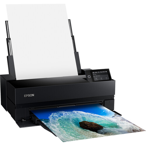
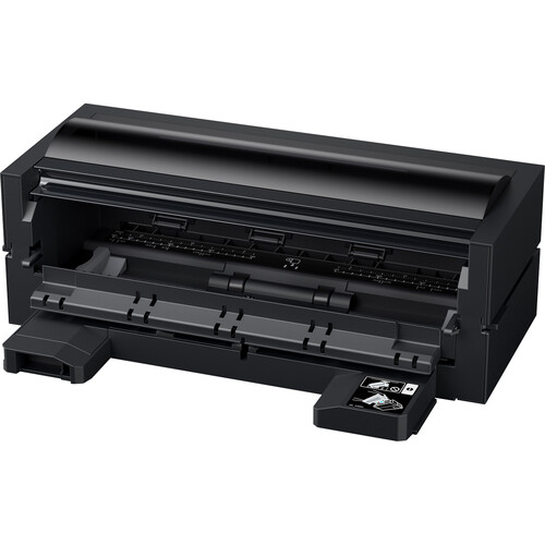
Epson SureColor P900 Review: A Worthy Successor to the P800 and 3880?
After 50+ prints across glossy, luster, baryta, metallic, and textured matte papers, the
Epson SureColor P900 has proven capable of outstanding results. The larger lesson is that paper choice,
ICC profiles, media settings, rendering intent, and borderless expansion can matter more than the
operating system or the printing application.
The P900 is a predictable, versatile 17-inch fine-art printer capable of superb output. Correct profiles and
settings produced closely matched results from Windows, macOS, Photoshop, and Epson Print Layout. Black
improvement is the biggest difference - days of wasting ink and waiting for swapping between photo and matte
black ink are over and carbon black setting result in the best DMax ever for Epson.
Provisional verdict: recommended for serious photographers who demand the best color accuracy
and reliability.
Photographers producing exhibition-quality prints up to
17 inches wide.
P800 or 3880 owners who want improved black performance
and improved range of color.
Users printing on premium papers like baryta, metallic,
and textured fine-art media.
Photographers willing to use ICC profiles, soft proofing,
and controlled print settings.
Who should skip
Anyone looking for inexpensive, low-maintenance casual
printing.
Users who do not want to manage profiles, media types,
and application-versus-driver color settings.
Photographers who routinely need output wider than 17
inches.
Enthusiasts who can't see the difference between
discount prints and premium color managed prints.
✅ Pros
✅Excellent output across varied mediaStrong color, tonal separation, and detail on glossy through textured matte papers.
✅Dedicated Photo Black and Matte BlackParity with Canon so no more costly and time consuming swaps between black ink types.
✅Strong color and monochrome workflowsImproved color gamut and Advanced Black & White Photo mode continues to produce excellent results.
✅Epson Print Layout reduces setup riskIt keeps more of the relevant print controls visible in one application.
✅Epson Media InstallerFinally Epson catches up with Canon's Media Configuration Tool to control media handling settings.
⛔ Cons
⛔On my systems, wireless printing failed to work on Windows 11Unlike the P800, wired USB was the better route for me with the P900.
⛔Poor Roll SupportP800 roll adapter isn't compatable, so a new P900 adapter is required that still lacks a cutting solution.
⚖️macOS wireless reliability needs more testingDuring a Cold Press Natural print, wireless triggered one 'device restarted' error from the sheet feeder.
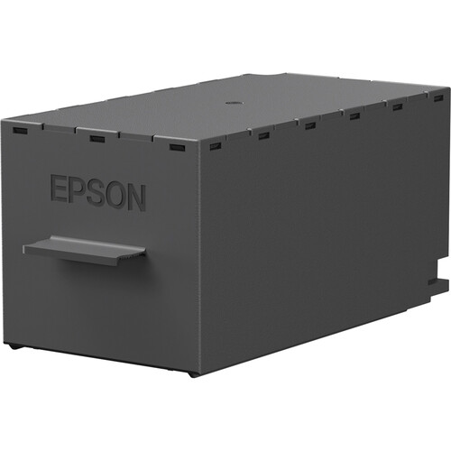
⚖️Operating costMaintenance-box needed replacement after only 30 prints, and starter inks were almost exhausted.
What I Tested
Print set: 30 tracked prints, plus 20+
untracked prints made between May 9 and June 12, 2026.
Platforms: Windows 11 and macOS Tahoe.
Applications: Photoshop 27.8/27.9 and
Epson Print Layout 1.5.15/1.5.16.
Drivers: Epson Windows driver 6.12.00
and Mac driver 13.26.
Rendering: Relative Colorimetric,
Perceptual, Saturation, and Advanced Black & White Photo.
The Windows driver will look familiar to experienced Epson users. For a Photoshop-managed workflow, the exact
printer-and-paper ICC profile is selected in Photoshop, Black Point Compensation is enabled, the matching
media type
is selected in the driver, and Color Adjustment is set to Off (No Color Adjustment).
The Mac driver exposes the same essential controls with a different presentation. Epson Print Layout offers
the
cleaner single-application workflow because the image, profile, media type, layout, and output settings stay
visible
together. I found no print-quality reason to prefer Windows or macOS: with matched settings, the scanned
evaluation
prints closely matched.
Epson Print Layout vs. Photoshop
Both produced strong results when configured correctly. The practical difference is workflow safety:
Photoshop is
more flexible, but it is easier to create contradictory settings between Photoshop and the driver.
Paper Matters More Than the Application
The clearest visual changes came from paper surface and paper white. Legacy Platine and Baryta produced rich
contrast; Metallic Glossy was punchier; Legacy Etching and Fibre changed perceived contrast, black depth,
and fine
detail through their matte texture. The right question is not which paper wins, but whether the P900
preserves
convincing color, tonal separation, and detail on each surface. It does.
Quality Level 5 Carbon Black vs. Maximum Quality
Both settings produced excellent results with Carbon Black offering better DMax which most will only see if
they measure the output with a spectrophotometer. The average person won't see the difference, so if you
fall into that camp then just using LEVEL 5 Maximum Quality will save a little ink. Personally, I use Carbon
Black as often as I can.
Rendering Intent Comparison
The cleanest direct comparison is Relative Colorimetric versus Saturation on Epson Metallic Photo Paper
Glossy
(prints 14 and 15), which share the same paper and quality setting. The Perceptual examples below were
printed on
different papers, so they show how that intent behaved across the broader test rather than serving as a
strict
intent-only comparison.
Print 14: Metallic Photo Paper Glossy, Q5 Carbon Black, Relative Colorimetric (Photoshop,
Windows 11).Print 15: Metallic Photo Paper Glossy, Q5 Carbon Black, Saturation (Epson Print Layout,
macOS).Print 8: Legacy Baryta, Q5 Carbon Black, Perceptual (Photoshop, macOS).Print 10: Legacy Etching, Maximum Quality, Perceptual (Epson Print Layout, Windows 11).
The differences among these scans are generally smaller than the differences produced by changing paper
surface and
paper white. Prints 8 and 10 show Perceptual succeeding on baryta and textured matte, but should not be used
to
attribute every visual difference to rendering intent alone.
Practical conclusion: Rendering intent matters most for colors near or
beyond the
destination gamut. Perceptual preserves relationships among compressed colors, Relative Colorimetric
preserves
in-gamut accuracy, and Saturation favors vividness — but none replaces soft proofing and a physical proof
print.
Print Quality Findings
Rendering Intent and Gamut
Rendering-intent differences were smaller than paper differences on much of the evaluation target. The
football
portraits were a better stress test: saturated blues could shift toward purple when the source exceeded the
printable
gamut. Changing intent and correcting the source improved the result but did not eliminate every issue.
Perceptual is
not a repair button; soft proofing, gamut warnings, and selective file correction still matter.
Black and White Printing
Print 16 used Epson Advanced Black & White Photo mode
on Legacy Etching with a Warm/Dark treatment, producing a result that felt intentionally photographic rather
than
merely desaturated. Print 17 complements it with a black-and-white image on Legacy Platine, where the
smoother
photo-black surface gives deeper-looking blacks and a more traditional presentation. A neutral ABW
comparison is still
needed.
Borderless Expansion
A Lightroom Classic Print module makes borderless a real pain IMHO. Epson Print Layout and Photoshop make it
much easier, but automatic expansion
cropped more than I would have liked. Images with important edge content should be tested with Minimum
Expansion or Retain Size
rather than accepting the default expansion.
Reliability and Maintenance
Most sheets fed normally. One of my Cold Press Natural prints via Epson Print Layout on macOS Tahoe produced
one 'device restarted' error from the sheet feeder, while a
later attempt via USB worked without issue. At print 30 the maintenance box was reported near end of service
life.
Because print 1 was not literally the printer's first print, total history, cleaning cycles, initial
charging, and
prior maintenance-box use must be established before drawing a cost or reliability conclusion.
What Online Images Can and Cannot Prove
Scans can compare gross color, contrast, paper white, rendering problems, and workflow failures. They cannot
faithfully reproduce gloss differential, metallic sheen, surface texture, deep-black appearance, or changes
under
different lighting. Final comparison photographs should are best viewed with a proper white balance under
controlled
lighting (e.g., a GTI Lightbox).
Real World Shots 📷
The photos below are real-world samples. Click any photo to open the original size.
Visit the gallery for a sample of Epson v750 scans of prints made during this review
Prints cover cross-platform, application, paper, rendering-intent, quality, and monochrome
tests.
Visit the gallery to view a wide selection of scans made of the prints done during this
review. Please refer to the filename legend in the gallery to decode the settings for each print.
Click the photo to open the original size 👆
The Windows Epson driver, with media, mode, quality, source, and color-adjustment
controls visible.
Windows driver 6.12.00 during print 1 on Ultra Premium Photo Paper Luster.
For Photoshop-managed color, the driver must use Off (No Color Adjustment) to avoid
double color management. Click the photo to open the original size 👆
The matching macOS driver exposes the same essential controls with a different
presentation.
Mac driver 13.26 during print 2, with the same paper, quality, and rendering intent as print
1.
The closely matched results make platform choice a workflow preference, not a
print-quality decision. Click the photo to open the original size 👆
Advanced Black & White Photo mode on Legacy Etching with a Warm/Dark treatment.
Print 16: Legacy Etching, Maximum Quality, Advanced Black & White, Warm/Dark.
Compared with textured Legacy Etching, Platine gives the monochrome image a smoother
surface, deeper-looking blacks, and a more conventional photographic character.
Click the photo to open the original size 👆
A small section of my favorite 13x19 prints that were family favorites for their
amazing color
Prints 25, 22, and 20 show how paper choice can complement very different photographs.
<strong>Print 25:</strong> Hahnemühle Photo Rag Metallic turned out
fantastic and will be framed.
<strong>Print 22:</strong> Epson Metallic Photo Paper Luster was claimed on the spot by my son for his personal use.
<strong>Print 20:</strong> Legacy Platine gave my favorite photo of my youngest daughter a result worthy of a prominent place in my studio beside my desk.
Click the photo to open the original size 👆
Prints 24 and 26 show the limits of correcting an intensely saturated source for a
metallic paper.
In this photo of my son Kai in his football uniform, the blues fall outside the printable gamut of Epson Metallic Photo Paper Glossy. I adjusted the file until Photoshop's soft-proof warnings were satisfied, but the corrected print still looked nearly the same as the first attempt.
Prints 24 and 26: the corrected file satisfied Photoshop's soft-proof warnings, yet the
physical prints retained nearly the same blue-to-purple problem.Photoshop warned me before I printed print 24, but sometimes substitutions save the day so I
gave it a try - and it failed.Here's print 24 as shown in Epson Print Layout and notice how it doesn't show any gamut
warnings.For print 24, soft proofing in Photoshop and the Photoshop pring dialog looked good
As print 24 shows, clearing an on-screen gamut warning does not guarantee a corrected print.
I also went to Photoshop to print and changed the rendering intent from Relative Colormetric to Perceptual which was a mistake.
This is totally my fault and I know better, but I was careless. It's a good reminder that even those with a lot of print experience can make mistakes too.
Paper, profile, neighboring colors, and viewing conditions matter, so a small proof print
remains the decisive test. This user error can easily be handled by doing test prints using a series
of small crops from problematic areas in a small print as I discussed in Printing 101 book.
The printing of the 17x22-inch, Print 30, on Ultra Premium Photo Paper Luster.
Print 30, the 17x22-inch sheet continues through feeder with no hassle on the P900.
Like its predecessors, unless you are using thick substrates (paper) that scratch
easily, it's safe to use the rear feeder for large prints. However, I did test and recommend the
front manual feeder with lots of space behind the printer when using thicker matte finish
substrates. Click the photo to open the original size 👆
The completed Print 30 did one of my favorite photos justice by producing outstanding
color and detail
Print 30: completed 17x22-inch print on Ultra Premium Photo Paper Luster.
I loved this print. The compact P900 produced a result with enough presence and quality
to stand beside one of my favorite large-format Canon PRO-2000 prints. An iPhone photo of a print
will never do it justice compared to viewing it in real life under a GTI Lightbox.
Click the photo to open the original size 👆
I love the new LED panel that displays the print and its settings while printing
P900 Adjustable color touch screen
You can swipe to get more settings while printing to ensure that the print received the
correct settings right at the start of your print job while there is still time to cancel.
Click the photo to open the original size 👆
My first two prints were a a status page and nozzle check on a piece of Velvet Fine Art
paper I had lying around
LED displays ink settings in full color
Ink levels shown are how much ink I had in the cartridges that came with the printer,
and the far right image shows that the maintenance tank started out nearly empty.
Click the photo to open the original size 👆
Here's what the P900 network status page looks like
First two prints - Status and Nozzle Check
I flipped the paper and did a nozzle check on the bottom and all looked great, so it
was time to print Click the photo to open the original size 👆
I was disappointed how quickly this message came up while there was still plenty of ink
left
Maintenance box end of life warning on Epson Status Monitor 3 for Windows
This makes me wonder if you'll need about 3 of these per ink set based on my
experience. Fortunately they were only $26 USD at the time this article was written.
Click the photo to open the original size 👆
No Carbon Black for you if you want borderless!
I was disappointed that I had to use Quality Level 3 to print borderless
LEVEL 4, LEVEL 5 & LEVEL 5 [Carbon Black] will give you a warning and uncheck the
borderless option for you if you try use it with these quality settings.
Click the photo to open the original size 👆
I like to have detailed filenames, but they may not make sense to you so I created this
Legend
Reference this sheet when trying to understand the cryptic filenames of the scanned files in
the photo gallery
Consider this as a good thing to print out using plain paper settings and a lower
quality setting to simplify your experience while viewing the photo gallery
Click the photo to open the original size 👆
Closing Thoughts
The Epson SureColor P900 has delivered consistently excellent output across a wider range of media than most
photographers will use regularly, and it worked well from Photoshop and Epson Print Layout on both Windows
and macOS. Correct profiles and settings produced close cross-platform results.
Compared with the P800 and 3880, my final recommendation is that it is a worthy upgrade thanks to improved media handling, dedicated photo and matte black to avoid the cost and delays of switching, physical size improvements, and a newer ink set that shows a visible advantage.
My experience is positive enough to recommend the P900 as a serious 17-inch desktop fine-art printer. The evidence supports a more useful conclusion than declaring every setting superior: the P900 is predictable, versatile, and capable of superb results when the person driving it chooses the correct media and color management settings.
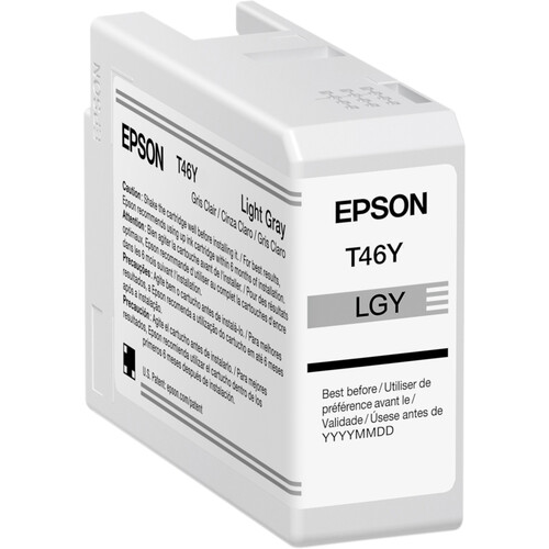
Epson SureColor P900 Roll Paper AdapterEpson Legacy Papers (Baryta, Platine, Etching, Fibre) — the fine-art surfaces used
throughout this test.Epson Maintenance Tank for SureColor P700 and P900 Photo PrintersEpson T46 Series UltraChrome PRO10 Ink Cartridge (50mL)GTI PDV Desktop Viewer Light Box