Thursday, September 21, 2017

REVIEW: Hahnemühle Matte Fine Art Smooth Rice Paper 100 gsm

Hahnemühle FineArt Inkjet Paper - Matte FineArt Smooth Rice Paper

In this article, I share my thoughts on the Hahnemühle Matte Fine Art Smooth Rice Paper (100 gsm). This is a less common and exciting paper to work with given its wonderful texture and semi-opaque nature. The specifications according to B&H are:

  • 100% Alpha-Cellulose Laid-Finished Paper
  • Basis Weight: 100 gsm
  • Thickness: 5.9 mil
  • Whiteness: 88%
  • Opacity: 85%
  • Water Resistant
  • No Optical Brightening Agents
  • Acid Free & Calcium Carbonate Buffered
  • Surface Finish: Matte

You can learn more about this paper on the website and get a datasheet here.

Unfortunately it seems to only be sold in 3 roll sizes plus one sheet size here in this US at this time.

ICC Profile / Color Gamut Analysis

The graph below shows how the color gamut of this paper is nearly identical to the German Etching paper I reviewed recent. In both cases I'm using the ICC profiles from the Hahnemühle Download Center.

Hahnemühle Rice Paper vs German Etching Color Gamut

Please note that ColorThink Pro gamut graphs are highly accurate but the mechanism to present them to you involves screen shots and imprecise window resizing so do not compare the height and width of this graph to other articles and draw any conclusions. The takeway here is that this has nearly an identical gamut to German Etching.

Pattern, Texture & Tooth

One of the reasons you get a paper like this is all about its texture. The following image is a crop from a 1200 dpi scan I took of this paper with the texture emphasized. Click to view the full size and zoom in and out to get a feel for the pattern and texture of this paper:

Hahnemühle Rice Paper High Resolution Scan of paper surface
High Resolution Scan - Click for Original

While the scan above most accurately reflects what the paper is like in real, here's a photo that emphasizes the "tooth" of this paper:

Hahnemühle Rice Paper High Resolution photo of paper surface
Photo of the paper's "tooth" with side lighting

This paper is semi opaque just like the rice paper screens you'd see in Japan which makes it wonderful for hanging in a way that allows for backlighting with the right image.

Test prints

I only had 25 sheets to test with, so I went through this paper really quickly testing it. What follows are a few letter sample prints that I made specifically for this review.

The first print is the the Outback Printer image is courtesy of the late but great Uwe Steinmueller and used by permission of Bettina Steinmueller. The semi-opaque nature of this paper makes it possible to see (at the right angle) light on the 253 square which is rare to see. The 2 & 4 squares both look the same shade and 6 is very hard to make out. 8 is really where you stat to see the grayscale appear. It should be noted that if you don't over ink the paper, you can see the  purple gradient under the 2nd baby almost all the way to the bottom of the bar:

Hahnemühle Rice Paper High Resolution scan of a Outback Printer image
Click to see the original Epson V850 high resolution scan

Relative Colormetric rendering intent ended up being the best choice for this image

The colors were typical for a matte paper.

Overall, this paper performed significantly better than I was expecting in turns of color accuracy and tonal range. It really is great stuff!

Zen Pathway

While this paper doesn't have the DMax of a baryta or resin-coated substrate, it's a paper that begs for Japanese calligraphy. As a result, I decided to go out on a limb and try this black and white image with loads of black to see how it would do. I'm happy to say that I was happy with the results and it looks good both in a frame or held up with soft indirect light backlighting the image:

Hahnemühle Rice Paper High Resolution scan of Zen Pathway (c) Ron Martinsen - ALL RIGHTS RESERVED
Click to see the original Epson V850 high resolution scan

Perceptual rendering intent ended up being the best choice for this image

Ancient Staircase of Mystery

This is one of those times where a blog article is inadequate as this print in real life held up to a window is simply magnificent. The semi-opaque nature of this paper creates a transparency effect that allows the light come through enough to make the vivid colors pop off the page, yet there's still enough substance to the paper to retain some of the depth of the blacks. This was truly a magnificent print that was ideal for this paper, and it is noteworthy as it's the first and only time I've found an image where the Saturation rendering intent was the right choice:

Hahnemühle Rice Paper High Resolution scan of Ancient Staircase of Mystery (c) Ron Martinsen - ALL RIGHTS RESERVED
Click to see the original Epson V850 high resolution scan

Saturation rendering intent ended up being the best choice for this image

Photoshop for Windows settings using a Canon PRO-2000

The website instructions for this paper were totally wrong, so definitely plan to do some experimentation using test prints before you'll get it dialed in with the right balance of ink to avoid oversaturating the paper.

For Canon printers, they fortunately have "manual" media types specifically for this scenario. The way it works is that there are 5 ink levels and Special media types dedicated to 5 levels of Photo Black ink (Special 1 - 5) and 5 levels dedicated to Matte Black ink (Special 6 - 10). For this paper, I found Special 7 was the right choice to maximize ink but minimize saturating the paper:

Canon PRO-2000 Main settings for Hahnemühle Rice Paper on Windows

Some might want to push the edge and do Special 6 to get more ink, but you'll need to be very careful to leave the paper alone after printing and let it dry in a very low humidity environment. Eventually the oversaturation marks (shown below) will go away, but they'll freak you out when you pull the print out of the printer:

Hahnemühle Rice Paper oversaturation example
Example of oversaturation on the backside of the paper
Click to see the original Epson V850 high resolution scan

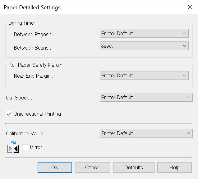
To keep oversaturation problems to a minimum, I also took advantage of the High setting which still gives you 600 dpi but seemed to apply slightly less ink. I also increased the drying time between scans to 3 seconds and did unidirectional printing to ensure that the ink started to dry sufficiently after each pass before the next overlapping pass was applied:

Canon PRO-2000 Paper Detailed settings for Hahnemühle Rice Paper on Windows

This helped quite a bit, so I highly recommend it. Eventually, I'll need to create a media type file that has these settings built in.

Like always, I turned off the printer driver color management:

Canon PRO-2000 Paper Color settings for Hahnemühle Rice Paper on Windows

Despite my box (ref no. 10 641 482) being labeled as 13 x 19, my Canon PRO-2000's auto-detect paper width feature alerted me to the fact that this paper actually measures out to A3+ size. As a result, I either needed to manually tell the printer it was 13 x 19 enter that in the driver OR let it auto detect as A3+ and match that setting in the driver as shown here:

Canon PRO-2000 Paper Page Setup for Hahnemühle Rice Paper on Windows

The only downside to using A3+  as the size is that the printable margin of this paper caused the image to not be centered perfectly. 13x19 solved that problem, SO this paper behaves best as 13x19 even though it is really A3+ sized. Well, at least that is the case at the time this article was written, but I suppose that could change with a printer driver update or possibly if printed from a different operating system.

I didn't try printing this paper from my Mac since I didn't have enough to test with.

As discussed above, Photoshop will accurately show you how your image will print so if you want it to be vertically centered the best then use 13 x 19 as shown here. However, please make sure that the printer, driver and Photoshop are ALL in sync on the size that you use - don't mix and match:

Canon PRO-2000 Photoshop Settings for Hahnemühle Rice Paper on Windows

About Hahnemühle

German paper maker Hahnemühle is well-known for making some of the best papers in the business since 1584 with the highest paper quality parameters for its Digital FineArt papers.

Conclusion

If you are the type of print master who enjoys matching the right paper to the right image or environment where your print will hang, then this is a paper you are sure to enjoy. While it is a delicate paper, it held up to reasonable handling much better than I expected.

The color gamut was significantly better than expected and the final result is something that is unique and special enough to get that "wow" factor out of your clients who appreciate something unique.

If you are the type of person who isn't a big fan of matte paper or  does most of your prints on Luster, then this definitely isn't the right paper for you.

While I was disappointed at the poor instructions on the website, my contact at Hahnemühle informed me that their website is currently being re-written and that a product support manager. As a result, I'm hopefully this problem will be addressed. Until then, I'd say plan on using about 5 sheets to dial in the right settings if you aren't able to mirror my settings that I settled on for the Canon PRO-2000. While I didn't print this paper using my PRO-1000, I'm confident that these same settings would be appropriate on it as well.

My Epson P800 ran out of yellow ink, so I didn't get a chance to test with it before I ran out of paper.

Overall, I highly recommend this paper for the serious print master. Amateur / casual users should work with Hahnemühle product support or a skilled print masters recommended settings for their printer to avoid oversaturation problems.

Where to Buy?

CLICK HERE to learn more or buy today.

Other articles you may enjoy

If you enjoyed this article, you may also enjoy these:

Enjoy these and more on the Reviews tab as well as Ron's Recommendations.

Disclosure

If you make a purchase using links found in this article, I may make a commission. It doesn’t cost you a penny more, but it does help to support future articles like this. While I was given paper for testing for this review, I was NOT paid or solicited to do this article.

NOTE: This site requires cookies and uses affiliate linking to sites that use cookies.

If you enjoyed this article, please support future articles like this by making a donation or saving money by using my discount coupon codes. Either way, your support is greatly appreciated!

This blog is intended for freelance writing and sharing of opinions and is not a representative of any of the companies whose links are provided on this site.

The opinions provided are of Ron Martinsen alone and do not reflect the view of any other entity

Thursday, September 14, 2017

A Point and Shoot Beats Most DSLR Portfolio Shots

All of the following photos were taken with a point and shoot (and no, it wasn't a Leica) which I serve up as evidence that it's more about the photographer than camera (although this is a pretty damn good camera too).

All images are Copyright Douglas Dubler 3 - ALL RIGHTS RESERVED. You may click to view full size versions in Google Chrome, but you may not save, print, download, link to, repost, etc... any without written consent.


"Summertime Boy" - 1/1250 at f/5 ISO 100 (-1 1/3 EV)


“Peruvian Jungle Lily” - 24mm at the closest focusing distance ( less than 8 inches) At f5.6


f/6.3 for 1/40 sec at 24mm (-1 EV)


"Lilies" - 24mm (widest) end of the zoom lens. At f4.5 at almost the closest focusing distance

And the camera was...


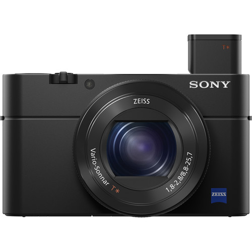
Sony RX100 IV  at B&H (review)
Also on available at Amazon

Yes, the Sony RX100 IV was used for all of those shots except the first one which was actually taken with he Sony RX100 III!

Of course, to be fair these were taken by one of the greatest living photographers of our time, Douglas Dubler (website). This legendary photographer has shot more magazine covers than most photographers have (or will have) portfolio caliber shots in their lifetime. He's also been the featured photographer for the launch of major products from Nikon, Epson and so many more. Simply put, these weren't taken by a mere mortal, but it does show off what this camera can do.

In Douglas Dubler's own words


24mm for 1/160 sec at f/8 ISO 100 (-1 EV)

Many people who are familiar with my work most likely associate me with high resolution capture and large format gallery prints. Much of this work is/was done on medium format digital backs or high megapixel DSLRs. Lately I have been exploring a different direction. Several years ago I purchased a Sony RX100 III for my girlfriend and began giving her photography lessons. As her photography progressed I noticed a look that I began to admire. 


24mm for 1/80 sec at f/5.6 ISO 100 (-1 EV)

They were done mainly at the 24mm focal length at the closest focusing distance (around 4 or 5 inches ). The small sensor gave her more than adequate depth of field at modest apertures (f4-5.6).  The wide angle lens gave just a little distortion which enhanced the subject. My best description is a hybrid of environmental and semi Macro.


24mm for 1/60 sec at f/5 ISO 100 (-1 EV)

Inspired, I began to emulate the effect with my A6500 and larger A7RII. Even with the APS-C sized sensor in the A6500 with various focal length lenses from the Sony 12-24mm ( on the A6500, a 18-36mm), to many different Zeiss,Sony and Sigma prime lenses I couldn’t get the look.  If I was shooting flowers to get the depth of field I would end up with a shutter speed that was too slow (wind vs. flowers!).  So I borrowed her camera and spent a few days at the New York Botanical Garden seriously photographing flowers. It took me one day to work out my approach but I was very happy with the beginning results.


"Maleficent Tree" - 24mm for 1/160 sec at f/5.6 ISO 100 (-1 1/3 EV) RX100 III

The next step was to make some prints, the whole point of photography.  With a little editing in my favorite Capture One V10 and of course B&W conversion done with Nik’s Silver EFex Pro 2 I was ready for the litmus test..  With my Epson P5000 and Epson’s new Legacy Platine paper I made prints that rivaled the best silver-gelatin prints.   As a test, at the beginning of one of my classes I had the students look carefully at one of  the prints and guess what camera I had used. Unanimously they declared a high resolution professional DSLR or mirrorless camera. I showed them the diminutive Sony and at first they thought I was joking. I assured them I wasn’t.


24mm for 1/60 sec at f/4 ISO 100 (-1 EV)

Since then I went out and purchased a MarkIV model which is around my neck whenever I leave my house. Even on my bike I can easily carry it in a small bag around my waist. Now no one even looks at me and I blend in with the iPhoners. I hand hold almost all of the images and as a result am able to shoot many more images. It doesn’t mean I will abandon my abstract Macro studies with the larger cameras and tripod but I have a feeling I will always have this camera hanging around my neck…

Douglas Dubler's thoughts on a couple shots


Black Dahlia - 24mm@f5.6@1/80sec, ISO 100, exp.comp.-1.3 stops

I found these two blossoms in perfect juxtaposition, full face and profile, which I am always looking for. They were the last shots out of 250 exposures that I did during my B&W class at NYBG last week.

I was actually on my way out of the garden and, in exiting, revisited the flowers I had shot earlier at around 6 P.M. I was tired after a long day of teaching but instinctively knew that those last few minutes of sublime light (exactly 7:11 P.M.) reward those who are patient. 

Processed in Capture One V10 and B&W conversion done in Nik Silver Efex Pro 2.


“Empress Lotus”

I have been trying for quite some time to get a good shot of a lotus blossom. For me that meant getting directly over the flower. Not so easy when you consider they grow in water, in this case, water that is over 5 feet deep. I surveyed all of the lotus in bloom and decided this was aesthetically my favorite. All I had to do was wait for the best light.  At around 7:10 P.M. the sun was no longer directly on the flower but was creating a beautiful soft illumination that seemed to be emanating from within the flower.

With some help from my friend Steve Titus (shown below) I was able to get an almost vertical camera angle and with the advantage of the articulating LCD could precisely compose the shot. It still took over 40 shots to get this precise uncropped composition.

Post processing, I had my friend Irfan Yonac do some digital enhancement using an “analog film” technique. It was the final step in the evolution of this photograph. Shot at 28mm@ 100 ISO @ f5.6 @ 1/200 sec, exp.comp.-1.0 stops.

Processed in Capture One software available at B&H.

Here's a funny behind the scenes shot of what it took to get this shot...


Conclusion

My review shows what mere mortals will get with this camera, but it's fun to see that in the hands of an X-Rite Coloratti Master like Douglas what is possible!

I really hope you enjoyed this guest blog from as much as I did. If so, please leave comments and check out more of Douglas's work on Instagram, Facebook,  or his website. Here's a couple more guest blogs from Douglas with his amazing work:

And here's one where Douglas breaks out the big camera that will really blow your mind:

Thanks Douglas!

Sincerely,
Ron Martinsen

Want to do a workshop with Douglas?

Contact me if you are interested in working with Douglas or doing a workshop with him in New York City.

Other articles you may enjoy

If you enjoyed this article, you may also enjoy these:

Enjoy these and more on the Reviews tab as well as Ron's Recommendations.

Disclosure

If you make a purchase using links found in this article, I may make a commission. It doesn’t cost you a penny more, but it does help to support future articles like this.

NOTE: This site requires cookies and uses affiliate linking to sites that use cookies.

If you enjoyed this article, please support future articles like this by making a donation or saving money by using my discount coupon codes. Either way, your support is greatly appreciated!

This blog is intended for freelance writing and sharing of opinions and is not a representative of any of the companies whose links are provided on this site.

The opinions provided are of Ron Martinsen alone and do not reflect the view of any other entity

REVIEW: Topaz Impression for Topaz Studio

Topaz Studio featuring Topaz Impression Pack


If you haven't Topaz Studio, it's a new product by Topaz Labs that is free and is built from the ground up to give you access to some great editing tools, but it also gets enhanced frequently to include new features. Recently they added Clarity and now they've added Impression!

Impression is our their most popular effect software, it’s capable of a near endless variety of realistic painting effects in a very short amount of time, so this is a great opportunity to get your followers and online communities excited about it’s release. Topaz Impression generates natural painterly effects by painting brushstrokes one at a time. (It just does this very fast!) Impression can paint over 10,000 brushstrokes in less than a second, all while completely following your artistic direction, making truly personal art that you can call your own.

Check out my Topaz Studio article if you want to learn more about Studio and check out my Impression review if you want to see what Impression can do for your images in the full stand alone version. The good news is here is that much of that functionality of the full version comes to studio along with many of its popular presets. Here's but of few of the 116 presets featured in the beta I used for this review:

Topaz Studio featuring Topaz Impression Presets

The final version is AVAILABLE NOW, so check it out!

Where To Learn More or Buy

Click here to download the Topaz Studio application and USE THIS LINK to buy Topaz Impression or CLICK HERE to learn more.

Clarity Now Available Too

I was shooting in Vancouver, Canada when the announcement that Clarity has been added to Topaz Studio:

Topaz Studio featuring Topaz Clarity

CLICK HERE to learn more about the Clarity plug-in pack for Topaz Studio.

Other articles you may enjoy

If you enjoyed this article, you may also enjoy these:

Enjoy these and more on the Reviews tab as well as Ron's Recommendations.

Disclosure

If you make a purchase using links found in this article, I may make a commission. It doesn’t cost you a penny more, but it does help to support future articles like this.

NOTE: This site requires cookies and uses affiliate linking to sites that use cookies.

If you enjoyed this article, please support future articles like this by making a donation or saving money by using my discount coupon codes. Either way, your support is greatly appreciated!

This blog is intended for freelance writing and sharing of opinions and is not a representative of any of the companies whose links are provided on this site.

The opinions provided are of Ron Martinsen alone and do not reflect the view of any other entity

Tuesday, September 12, 2017

REVIEW/DISCOUNT: Breathing Color Art Peel - Inkjet Printable Wall Fabric with Repositionable Adhesive (A Canvas Alternative)


Breathing Color Art Peel (24 x 48" Panels x 3)

At this point you are probably wondering what the heck a "Inkjet Printable Wall Fabric with Repositionable Adhesive" is and why you should keep reading?!!! However, if you do your own printing you are going to love this stuff WAY better than canvas.

In a nutshell, as you can see from the crooked iPhone shot above, this stuff is a high quality fabric that you can print on and then hang like wallpaper. However, it has a big benefit - you can remove it and reapply it which is great if you are terrible at hanging wall paper like me!

Here's a short video that shows how the adhesive works on my dusty laundry room wall:

The funny thing is that I printed that print around July and have hung it around my house in several places before leaving it sitting in the hot laundry room for the last few months. I didn't clean or prep the walls - I just stuck it like you would a post it note just to see what would happen. In fact, my goal was to get it to wrinkle or peel off, but that didn't happen!

Once I was sure it would work great, I finally decided to go big and printed a 72 x 48" version of one of my favorite images - Treehouse (but an all new edit that is warmer and more saturated).

Perfect Resize from on1 - Tile Feature (Click to view screen shot at full size)
Perfect Resize from on1 - Tile Feature (learn more)

I used Perfect Resize to make it big and split it into three tiles (as shown above), but in retrospect I should have taken advantage of the overlap feature. I also had some issues with the AM1 file I used with my Canon printer, so I couldn't do borderless which was a bummer too. I don't have a steady enough hand to cut something that big perfectly, so I just hung it with the lame borders. That said, it still looks amazing when hung and I get asked all of the time "what is that", since this fabric is unlike anything I've ever seen (and most likely you too).

Print Quality

I printed out some letter size prints using the ICC profile that I got from Breathing Color for my Canon PRO-2000 printer, and using my Epson V850 pro scanner I scanned the swatches. Of course this means the grayscale ramp, gray squares and black squares lose some fidelity (you can see more in real life), but this gives you a ballpark idea of how good this stuff is as these images are scans of prints - which always suck - yet these look pretty good...


Full Resolution JPEG V850 Scan of a Art Peel Print from Canon PRO-2000

The printer evaluation image turned out great with the reds and skin tones being spot on


Full Resolution JPEG V850 Scan of a Art Peel Print from Canon PRO-2000

This turned out accurately, but you can see that the background is a little stronger green than black compared to the original file. With that said, this still looks good enough to hang on a wall.


Full Resolution JPEG V850 Scan of a Art Peel Print from Canon PRO-2000

Here's a smaller version of treehouse that has been resized via the printer from the original.
I felt the colors were very good with all things considered, so going big was no problem - and I'm glad I did it!

ICC Profile


ICC Profile Comparison of Art Peel
vs Canon Artistic Matte Canvas
vs Epson Exhibition Matte Canvas

I decided to compare the ICC Profile with a Canvas profile for my PRO-2000 and an Epson P800. While you can see there's definitely some gaps in the tonal range, it  is in the ball paper with those much higher fidelity substrates. Those doing color critical work might have to do a little tweaking to get the best results, but I think most users will be happy right out the gate with what you get using this substrate. Breathing Color has done a fantastic job of providing good ICC profiles for Art Peel!

Using Art Peel in Photoshop on Canon PRO-2000

Here's my workflow for printing onto Art Peel using my Canon PRO-2000 printer from Windows.

In my case I had a custom media type AM1 file that I got from Breathing Color. The advantage of it is that I knew I'd get the right amount of ink on the substrate, but the downside is that this AM1 file was made for a PRO-4000 so I couldn't edit it (due to a software limitation). The reason I wanted to edit it is because this AM1 media type file didn't allow borderless printing which I really wanted to do. If I were you I'd work with Breathing Color to get a new one that supports borderless:

PRO-2000 Main Settings for Breathing Color Art Peel

I click Color Settings button and set matching to Off because I like to specify the ICC profile in Photoshop for Soft Proofing, even though AM1 files support embedded ICC's:

PRO-2000 Color Settings for Breathing Color Art Peel

In this example, I'm just showing a letter size print but with the AM1 file I had even if I were to set borderless I'd still get a border. As a result, my advice is to experiment and start small with test prints before you start making your big prints.

PRO-2000 Page Setup Settings for Breathing Color Art Peel

In addition to using rotate page 90 degrees like I did above, I also like to use No Spaces at Top or Bottom to get a final product that wastes as little paper as possible. My AM1 also blocked cutting so I had to manually advance and cut with scissors on a crop line.

PRO-2000 Layout Settings for Breathing Color Art Peel

In Photoshop the key thing was to do was make sure I selected Photoshop Manages Colors, the correct ICC profile, and I found Relative Colormetric with Black Point Compensation gave me the most accurate color results:

2017-09-09_10-48-35

I typically click Gamut Warning too just so I can see what colors are going to get impacted by the rendering intent selection and if I want to make image adjustments to bring colors back into gamut.

The workflow is effectively the same on the Mac or other printers, but the names and locations of things change. Check out my printing series to see how I print from other products like Breathing Color Lyve Canvas using Epson printers or Legacy Papers to see both Windows and Mac printing from Photoshop and Lightroom

Conclusion

This is by far the most exciting time I've had printing because I was able to make a favorite print of mine come to live in huge 72x48 wallpaper print that was easy to hang (and trust me I suck really bad at hanging wallpaper). Air bubbles and wrinkles were no problem as I just peeled it back and tried again. This stuff has some really great adhesive so it didn't damage any of the paints or sheetrock I applied it to, and despite not prepping the walls it stuck well and didn't show the wall texture through the paper (probably mostly due to my test images being very busy).

My wife is dying to do some wallpaper for the baby's room with this stuff and I've got some fun ideas for the garage and man cave! As far as papers go, it may not have the highest DMAX of papers I've tested this year, but I've seen worse from many canvas products. It also is good enough when viewed at a short arms length to be good enough that people never asked me about the things I saw wrong with the large print - they only asked me what this cool product was and how could they use it to make their own big prints with it.

I HIGHLY recommend this product which comes in two versions. The regular Art Peel and the Art Peel Blackout version which features a backing that prevents the wall color from showing through. This is important if you want to put a light colored print on a dark wall and not have the wall color ruin the print.

Discount & Where to Buy

Well the good news is that you can save 15% when you use my coupon code RMAP15 as shown below (contact me if there's any problems with the code):

image

CLICK HERE to learn more about or order Art Peel today.

Other articles you may enjoy

If you enjoyed this article, you may also enjoy these:

Enjoy these and more on the Reviews tab as well as Ron's Recommendations.

Disclosure

If you make a purchase using links found in this article, I may make a commission. It doesn’t cost you a penny more, but it does help to support future articles like this.

NOTE: This site requires cookies and uses affiliate linking to sites that use cookies.

If you enjoyed this article, please support future articles like this by making a donation or saving money by using my discount coupon codes. Either way, your support is greatly appreciated!

This blog is intended for freelance writing and sharing of opinions and is not a representative of any of the companies whose links are provided on this site.

The opinions provided are of Ron Martinsen alone and do not reflect the view of any other entity

Aurora HDR 2018 for Windows and Mac (DISCOUNT)

Aurora is one of the easiest to use HDR programs on the market and in this new version it gets faster, more powerful and significantly improved. Results from my early testing show the best merging of nighttime skies which typically turn out pretty nasty in Photomatix, HDR Efex Pro,  and even older versions of Aurora HDR

Don't know what this is or what it's all about? Start by checking out my older reviews and tutorials for my Aurora and later Aurora 2017 reviews.

The latest version has finally been announced and I've got a special offer for you:

Click to Pre-Order Now!

One of the most common FAQ's I had since my original review of Aurora (and later Aurora 2017)  was when are they going to make a Windows version? The cries got even worse after I did my Luminar for Windows Open Beta article.

Here's a look at the new UI for Aurora HDR 2018 Windows:

Click to see the new Aurora 2018 for Windows UI

and Mac:

Click to see the new Aurora 2018 for Mac UI


What's New

Here's a list of all the changes which I'll feature in a new tutorial later this year:

  • Next-generation Tone Mapping – A new smart Tone Mapping algorithm automatically reduces noise, and produces more realistic and natural initial results.
  • Mac and Windows versions – Aurora HDR 2018 is available both for Mac and PC users, enabling mixed-computer households to share the same product key.
  • Lens Correction Tool* – The new Lens Correction filter easily fixes all kinds of lens distortion, from barrel and pincushion to chromatic aberration and vignetting.
  • Transform Tool* – Easily scale, rotate and shift your image to better fit your vision.
  • Dodge & Burn Filter – Selectively lighten or darken specific areas of an image to artfully direct your viewer’s eye towards the key subject of your image, similar to a traditional darkroom technique.
  • HDR Enhance Filter - Adds details and clarity to an image, adjusting colors, details and contrast without creating artificial halos or other problems.
  • User Interface – A new, modern and responsive user interface brings a powerful, yet  joyful experience to HDR photo editing.
  • History Panel – An easy-to-reference list of edits made to your image, the History panel allows you to click on any editing step to revert the photo to an earlier stage of editing.
  • Touch Bar support for Mac – Aurora HDR 2018 adds Touch Bar support to give new MacBook Pro users fast access to key editing features and speed up their workflow.
  • Image Flip and Rotate* – Perfect for correcting photos with incorrect horizons or making creative compositions or other stylistic changes to an image.
  • IMPROVED:  New Structure Algorithm – The re-developed Structure tool allows you to adjust detail and clarity of an image to get a classic HDR effect with great detail or a smoother effect with less details.
  • IMPROVED: RAW handling – An improved RAW conversion brings out more details in shadows/highlights, displays colors more accurately and reduces noise in RAW files.
  • IMPROVED: Crop tool update – Now specify custom crop sizes for even more versatility.
  • IMPROVED: Speed – Faster merging and masking performance, improvement in RAW image processing.

* Lens Correction and Transform tools, as well as image flip and rotate will be available in the Mac version at launch, and arrive in the PC version with the first free update in the beginning of October. Other tools and features that are currently available for Mac only would be added to PC version by the end of the year.

Conclusion

Much like Luminar, the Windows version isn't quite as polished as the Mac version - YET, but the folks at Macphun tell me that it's a high priority to get them to be functionally identical. I've been impressed with what I've seen so far and can't wait to show you more in the near future.

Get Your Discount Now

CLICK HERE to learn more or pre-order today. While you are at it check out the Luminar Aerial Update too!

Pre-Order Pricing:

  • Current users of Aurora HDR may upgrade at a special pre-order price of $49 ($59 MSRP)
  • New users can purchase Aurora HDR 2018 at a special pre-order price of $89 ($99 MSRP)
  • A collection of bonuses will also be included with every purchase.

Pre-Order Bonuses:

  • Trey Ratcliff Deep Dive video
  • Travel Photography Tutorial by Matt Granger
  • Source Brackets
  • 3-month Zenfolio Pro website, including a complementary design consultation. $60 value.

Other articles you may enjoy

If you enjoyed this article, you may also enjoy these:

Other articles you may enjoy

If you enjoyed this article, you may also enjoy these:

Disclosure

If you make a purchase using links found in this article, I may make a commission. It doesn’t cost you a penny more, but it does help to support future articles like this.

NOTE: This site requires cookies and uses affiliate linking to sites that use cookies.

If you enjoyed this article, please support future articles like this by making a donation or saving money by using my discount coupon codes. Either way, your support is greatly appreciated!

This blog is intended for freelance writing and sharing of opinions and is not a representative of any of the companies whose links are provided on this site.

The opinions provided are of Ron Martinsen alone and do not reflect the view of any other entity